Nikon Nikkor Z 24-70mm F2.8 S lens review: Nikon’s best 24-70mm to date
What is it?
The Nikkor Z 24-70mm F2.8 S [advertiser link] is the first pro-oriented lens for Nikon’s full-frame mirrorless Z series cameras, currently the 24MP Z 6 and the high-resolution Z 7. Naturally, it’s a constant-aperture, high-speed standard zoom and has several features not found on the earlier consumer grade Nikkor Z 24-70mm F4 S [concise review].
Besides the larger initial aperture the new lens features 17 elements in total, two of which are ED glass to lower color fringing and four are aspherical to reduce distortion and spherical aberration.
Like others in the S-series, it has Nikon Integrated coatings while fluorine coatings are used to help keep the front element and rear clean. It also features Nikon’s Arneo and Nano Crystal coatings to further mitigate flare and ghosting. While the F4 version features the latter coating which is unusual in a consumer-grade lens, Arneo is seemingly reserved for their high-end glass. I suspect Arneo is employed on one or maybe two rearward-facing surfaces of elements close to the sensor to reduce reflection. Although there are image quality benefits in mirrorless designs, one of the downsides is the rear-most element is very much closer to the sensor’s filter stack and therefore at greater risk of reflection from it.
The new lens also has nine rounded aperture blades, up from seven in the F4, and uses a stepping motor to move two separate focusing groups with near-silent and smooth operation. Although a new occurrence in AF designs moving two separate focusing groups is not really a new idea at all. In any case, this should reduce aberration at close distances (think Nikon CRC from the 1980s).
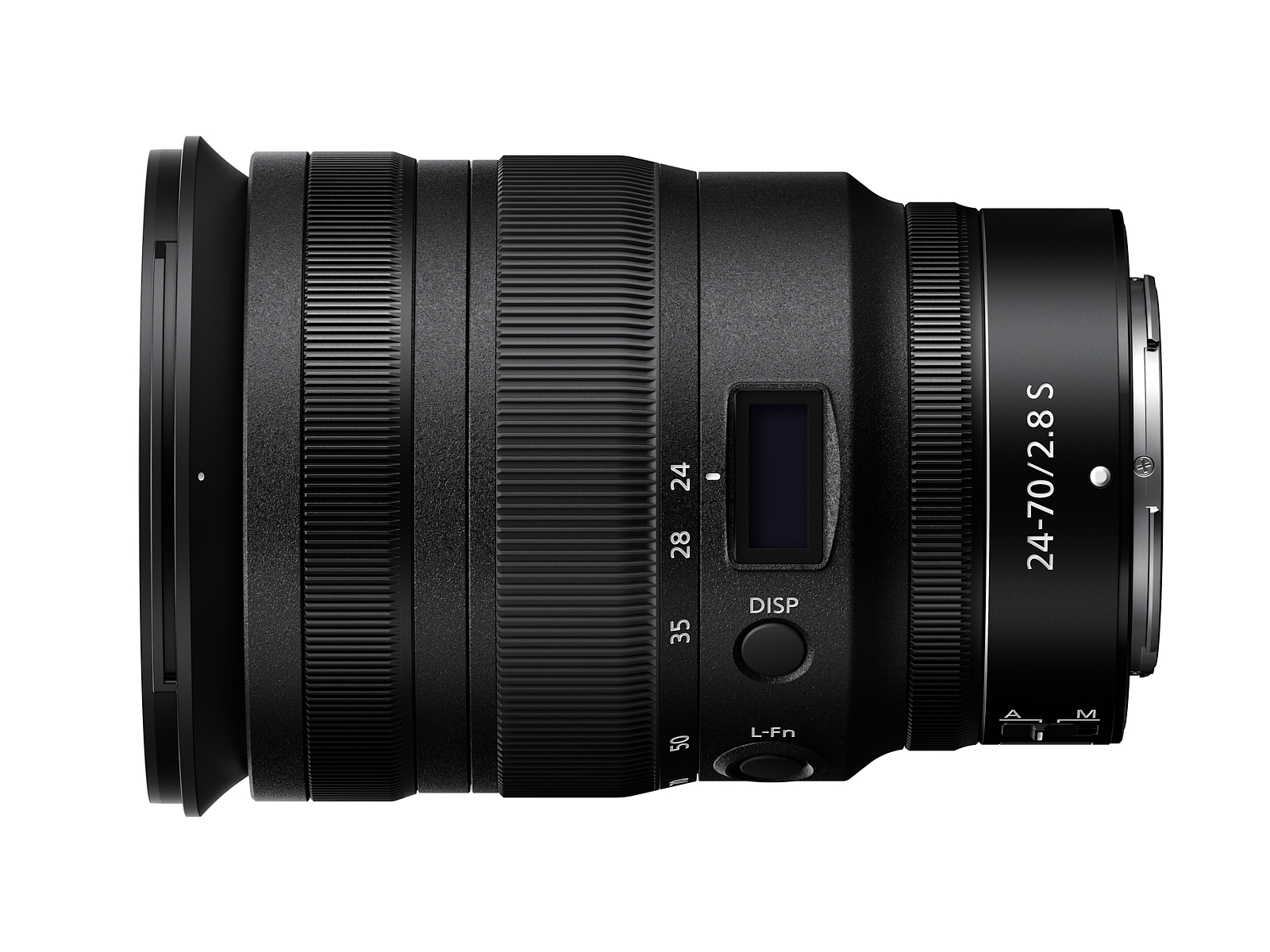
Externally there’s a wide rubber zoom ring and a narrow and a ribbed, metal customisable control ring that can be used to adjust aperture values or exposure compensation. Unlike the F4 zooms and the F1.8 primes in the current Z- line up the customisable ring can’t be used for manual focus. Instead, the F2.8 model differs by the addition of a third wider ring placed in front of the zoom, which is solely for manual focus (electronically controlled). At the time of writing it can’t be customized, which is a shame. I would like it to be able to switch roles between the two rings.
The new F2.8 model is also the first from Nikon to adopt a small OLED screen on the lens barrel, first seen on the Zeiss Batis series, only smaller. Although much maligned on the internet, the screen can display aperture or focal length, but far more useful is the option to display focus distance with a depth-of-field scale below. The downside is that it’s quite small and the glass covering is prone to fingerprints. The options can be cycled through using the dedicated Disp. button on the side, which saves programming a button on the camera (though that’s not an option anyway). However, there is a programmable L.Fn. button as well – more on that later.
As you might expect with a lens that’s the better part of £2,300/$2,300, it is extensively sealed against dust and moisture and uses a mixture of high-quality alloys and engineering plastics for the outer shell.
The new lens also features a mechanism (in all likelihood one of the features of the dual focusing groups) to reduce the effects of ‘focus breathing’ (a slight change in focal length at close distance, which alters the magnification/angle of view) and there are some claims that it’s also ‘parfocal’ (the focus point doesn’t change when zoomed). None of these things affect the stills photographer but can be troublesome for filmmakers. It’s certainly better in that respect than the Nikkor Z 24-70mmm F4 S and more likely uses some compensating mechanism rather than being optically designed that way. The minimum focusing distance is 35cm (11.8″).
Measuring 126 mm x 89 mm (4.96” x 3.5”) and weighing 805 grams (1.77 lb) the new Nikkor Z 24-70mm F2.8 S [advertiser link] is quite a lot larger than the F4 version but it’s still relatively compact for a lens like this.
Key Specs
- Full frame Nikkor Z mount
- 17 Elements in 15 groups
- F2.8-22
- Circular 9-bladed aperture
- 82mm Filter Thread
- Dimensions (L x D) 126 mm x 89 mm (4.96” x 3.5”)
- Minimum focus distance: 35cm
- 0.22 x max. magnification
- Weight: 805 grams (1.77 lb)
Check Prices and Availability
Build quality
While the Nikkor Z 24-70mm F4 S is certainly attractive in size; it matches the smaller proportions of the Nikon Z 7 [advertiser link] and Z 6 but it doesn’t have the build quality of the Nikkor Z 24-70mm F2.8 S. While build is a bit subjective you can get an insight by the way the lens feels in the hand. And the Nikkor Z 24-70mm F2.8 S certainly feels very good. The zoom ring is smoother than the previous F-mount models though it’s not quite to the level of some rivals. Still, it’s an improvement and something you probably wouldn’t notice, unless you’ve had hands-on with other offerings.
Both the control ring and focus ring are very heavily damped, the dedicated focusing collar particularly so and they’re both electronic in operation. However, the control ring is easily nudged – it isn’t click-stopped, and as such I often found I had changed settings without noticing.
Attention to detail is a bit better than we’ve seen on the earlier S-series. Unlike the F4 S models for instance, there’s a decent-quality flocked hood. It uses fabric material rather than paint or moulded plastic and, importantly, has a locking button instead of the more typical tension spring to lessen the mechanical twisting of the extending barrel.
Handling
The new Nikkor Z variant is quite a handful on the diminutive Nikon Z 7 but to me, handling is much improved over the F-mount models when on something like a D810 or D850 and just about as good as it’s going to get. It’s also worth mentioning the size of the hood. It’s very small compared to the huge hood of the Nikkor F model, and greatly reduces the overall visual bulk in comparison.
As an F2.8 zoom the lens is pretty heavy, especially when compared to the F4 S. When it wasn’t on a tripod, I simply always supported it in my left hand and let the Z 7 hang off it. That allows your right much more dexterity when it comes to moving around the camera controls. The Nikon Z 7 would, however, be even better in this regard if there was a battery grip option. Update (Oct, 2019), there is a grip now, but it’s an afterthought and not really worth the high asking price.
Still, most of the internet is more concerned with the fact there’s just one XQD slot. Yes, it would have been better to have two, or even if it was supplemented by an SD UHS-II slot, like the Phase One IQ4 backs, but XQD is more reliable and the design is more durable. While I don’t like the fact that the XQD price is relatively high, for me a battery grip would have been more useful. We’ll see a Nikon Z 9 before too long, I guess, where these and other matters will be addressed.
Still, the Nikkor Z 24-70mm F2.8 S handles very well indeed. The zoom ring is much smoother and with a more pleasing resistance to use than previous F-mount versions and the inclusion of both a focus collar and separate control ring is an improvement over the Z-mount F4 S models. Though not everyone is going to like the position and distance between them. Personally, I prefer the layout of the Canon RF lenses, where the focus collar and control ring are next to each other, allowing you to flick between them without any thought. I can’t do that easily with this lens, but in time that would change and it certainly prevents inadvertent adjustment, which as I mentioned earlier is quite easy to do as the control ring is both relatively light and smooth in operation.
The built-in display has received much criticism online. Admittedly, the option to display the focal length isn’t much use, but the option to display the aperture is more relevant and the focus distance with a depth of field (DoF) scale may be very useful once its accuracy is fully understood. While it could be improved, with a larger display and clearer distance information, it looks to be more than just a gimmick. Maybe one day the DoF scale could adapt to the sensor resolution’s circle of confusion, but I’m not holding out for that. Still, it would be useful (and more easily achievable) to see the DoF scale in the viewfinder.
In terms of placement the L.FN button, which has according to Nikon’s PR material 21 assignable functions, it falls perfectly under my left thumb. For all those potential functions, though because of the weight distribution, it’s probably better to leave it to the default, which is to initiate AF from the lens rather than using the camera’s rear AF-ON option. Left this way, with AF set to AF-C, you can easily switch between manual override, AF-C and AF-S by lifting your thumb off it. Despite that, there were times when I would have liked a few more options, including one to switch off peaking when using manual focus (a point mentioned elsewhere in the review). But that aside, it is a very valuable inclusion and one that Nikon can easily refine from feature requests and implement in firmware updates.
Performance
In use, AF performance is fast, faster than you might expect for an STM-type motor, and it’s unlikely that you’ll miss the speed of the Nikkor F version. It’s also very quiet and smooth and it’s even quieter than the F4 S version which has a high-pitched shrill sound.
With the latest firmware update (V2.0) the Nikon Z 7 and Z 6 now have an Eye-detection AF option. I like how it allows you to easily switch between left and right eyes using the joystick (or sub-selector, as Nikon call it). It has an on-screen pointer to remind you that you can switch which is nice but the question is, how well does it all work?
Well, it offers a high level of success in terms of quickly identifying and acquiring the eye but it doesn’t appear able to accurately focus on the iris itself and seems more influenced by the eyebrow or eyelash when close, thus front-focusing. Much the same can be said of Canon’s Eye-AF feature on the Canon EOS R as well. Intriguingly, the Nikon Z 7’s Eye-detection AF focusing bracket resizes to a smaller square bracket when further away and encompasses just the eye (rather than including the eyebrow as before), and it seems it is slightly more accurate but still not capable of focusing on the iris despite repeated attempts. With F2.8 being the widest aperture there’s too much depth of field.
What would help with testing is a high-speed, AF-capable short-tele with razor-thin DoF such as the excellent AF-S Nikkor 105mm F1.4E on the FTZ, but I didn’t have one available at the time. (Update, July 2020; both systems have since been improved)
Although not a feature of the lens exactly, I would like to see focus peaking better implemented. While peaking can be used when zoomed into the image, when you zoom back out to check the composition I find it obscures detail and is highly distracting. I would like to see an option to temporarily switch it off. It should be easy to implement alongside the options to reduce viewfinder/monitor clutter or perhaps added as an option for the lens’ customisable L. Fn button.
There’s also a limitation where the peaking and the zoomed-in option can’t be used when focusing stopped down beyond the AF-system’s F5.6 limit.
Sharpness
A parfocal zoom is useful for video, as once focused there’s no focus shift when changing focal lengths. Despite being well suited for video in other respects, I have to report that there’s some forward focus shift during zooming. Bear in mind that peaking may still indicate that it has remained in focus but if you examine images or footage closely then the focus shift is evident. My advice would be to always refocus after changing focal lengths.
In these sharpness samples, I’ve taken test shots to include foliage as the human visual system is acutely tuned to it. These shots were taken on a very still day, and this valley is usually quite protected from wind, otherwise, any movement will make the outer zones look blurred. Even so, I’ve tried to keep shutter speeds high to prevent that while also including buildings for reference where possible but that can be a stretch at F16 and F22. The shots below are 100% crops with the point of focus in the centre. Nikon Z 7 on a tripod with a 5-second release. All images are processed from RAW in Capture One Pro (default settings with vignetting correction but no chromatic aberration compensation).
Sharpness at 24mm
Wide open at F2.8 in the centre, this lens has very good contrast and resolution but the mid-frame is a little soft. The corners are quite a lot softer. However, notice the lack of lateral chromatic aberration. One stop down, at F4, and there’s quite an improvement across the frame right out to the corners. At F5.6 it’s hard to tell the difference between that and F4. At F8 the effects of diffraction can be seen already with the centre, corners and mid-frame being a little softer. At F11, all positions are softer than F8 and F16 and F22 (both not shown) are noticeably softer. The use of F22 is not recommended.
Sharpness at 35mm
Performance is impressive at 35mm. Wide open, contrast and resolution are good centrally and that extends from the centre to mid-frame (albeit a little soft still compared with the centre). As you might expect, there’s some slight loss of sharpness apparent in the corners. At F4, the centre and mid-frame perform very well indeed. There’s a noticeable improvement from F2.8, but there’s some softness still in the corners. At F5.6 contrast and sharpness are excellent, and the corners finally are closer, albeit not quite there) to the middle frame performance. And it’s a similar result for F8, with some slight loss of resolution in the centre but an improvement in the corners. At F11, diffraction is pulling the resolution down but the contrast remains good. Intriguingly, the corners are still quite close to the results at F8. The corners remain good at F16 albeit lower in resolution than them at F11, while the middle and centre are noticeably behind. I suspect this is due to some field curvature. It’s relatively easy to check for, once detected, but I no longer have the lens.
Sharpness at 70mm
The Nikkor Z 24-70mm F2.8 S continues to perform well at 70mm. As you can see from the image above, I’ve had to move the middle and corner areas of interest (highlighted the red square outlines) slightly at 70mm so that all three are in the same focus plane. The centre remains unchanged as that was where the lens was focused. Wide open at F2.8, the Nikkor Z 24-70mm F2.8 S has good contrast and resolution in the centre and middle zones, but the corners (now unavoidably the extreme corners) are noticeable behind. All three zones improve at F4 but not by much except in the corner and it goes to show how good it is at 70mm when wide open. Peak sharpness is achieved at F5.6, at least centrally. In the mid-zone, there isn’t much of an improvement, if any, over F4. At F8 the lens displays the most uniform sharpness from the centre to the corners but it already displays some diffraction, lowering overall resolution very slightly (though really not by much at all). The same can be said for F11 where resolution falls very slightly from F8, except for the corner which appears a little sharper, which again suggests some slight field curvature as the corners move into focus.
Chromatic Aberration
This lens has very low levels of lateral chromatic aberration and there’s no axial or longitudinal chromatic aberration to speak of, though as an F2.8 zoom that’s not always a given. If the latter is present it can be very distracting in specular highlights. But I’m pleased to say that’s negligible, even if the circular highlights appear truncated slightly (commonly referred to as “cats’ eyes” on the internet).
Like distortion, this lens has a “built-in” profile. What that means is that the corrections are detailed in RAW files but that data isn’t usually available for third-party apps like Capture One and Lightroom and it has to be reverse-engineered. Fortunately, with Capture One Pro at least, you can analyse the image for lateral fringing anyway which always produces a better, cleaner result than any profile as it analyses the image from your lens (and sensor combination). Despite that, even with the profile corrections turned off Nikon has done a very good job with reducing the fringing using the optical construction alone. It’s much lower than Nikkor F versions and with profile corrections applied it’s negligible.
Geometric Distortion
This is one area that is aided by the built-in profile and you could argue that the vast majority of users will view and process their images with that enabled. However, as a reviewer, I’m always sceptical. I like to see how well a lens is optically corrected first before seeing how well the profiles are applied. Bear in mind, that RAW image processing software like Capture One Pro or Lightroom typically has to reverse engineer the corrections (sometimes to differing degrees) before they’re as Nikon intended them. So thinking the profiles will correct every detail perfectly is an assumption. Besides, manipulating pixels this way is known to reduce micro-contrast and may even produce or add to the smearing we sometimes see in the corners of a frame.
Vignetting
It would be unusual if this lens didn’t show any signs of vignetting or corner shading. Even with a larger mount and large rear element, because the lens sits closer to the sensor there’s probably more reason for it. Still, we don’t know the design of the sensor, the filter stack or quite how the shape of the micro-lenses affects how those acute light rays are handled.
Presumably, the Nikon Z 7 sensor has offset micro-lenses and perhaps even specially shaped micro-lenses, like the Leica M series which are even more highly convex than those of the Leica SL, but the evidence is still a bit thin on the ground. Suffice it to say it’s quite noticeable at F2.8 – I don’t use Imatest any more so I can’t measure it directly but it’s close to -2EV in the corners and far less of an issue at F4.
Overall thoughts
After reviewing all of the other Nikkor Z lenses for other publishers (I may review them here also, in time), I had expected to be impressed by this lens and I haven’t been disappointed. I much prefer to it all the previous AF-S Nikkor versions. Although much larger and pricier than the Nikkor Z 24-70mm F4 S [see concise review, here], it feels better made and still handles well on the Nikon Z 7. Admittedly, the balance is improved with the weighty Arca Swiss Universal L-bracket I use for reviewing, but even without it, it’s still quite manageable.
Auto-focus is impressively fast as well, though I didn’t have a Nikkor F version to try side-by-side, I doubt many people, even sports photographers, would be left wanting. Granted the Nikon Z 7 may not be the most appropriate camera for sports, but the Nikon Z 6 isn’t exactly a slouch (though obviously no Nikon D5).
What’s impressive about this lens though, besides the excellent sharpness, is the very low lateral chromatic aberration. That was always quite high with the previous Nikkor F models and that and the distortion, build and general handling never really impressed me. This is the first Nikkor 24-70mm F2.8 from Nikon in recent times to stand out and if cost isn’t a concern, this lens is well worth checking out. It’s quite possibly the best 24-70mm F2.8 currently available.
Check Prices and Availability
One Comment
Pingback: