Loupedeck+ review: The future of image editing?
What’s the issue with the application interface?
Parametric editors like Adobe Lightroom, Apple Aperture (and now Photos), Phase One Capture One and others that use simple sliders to make adjustments have truly democratized the RAW conversion and editing process. However, their ease-of-use coupled with the desire to do more with them has compounded the issue of space within the application’s interface.
With each successive update, developers have added more features and expanding capabilities, and the workspaces are becoming increasingly cramped.
Taking your eye off the image to take time to find the tools isn’t ideal in any scenario let alone a pressured shoot. This is very disruptive to your concentration and can impact quite negatively on your workflow. Then there’s the additional distraction of adjusting sliders accurately. While the Magic Mouse supplied with Apple’s range of iMacs is great, clicking and dragging or even scrolling using touch to adjust the slider slows me down, and the touchpad of the MacBookPro isn’t any better. Compounding this issue are tools that adopt multiple sliders to make successive adjustments to achieve a cumulative effect, such as sharpening, noise reduction and even exposure control.
While making adjustments using sliders is simple enough, there’s a distinct if sometimes brief disconnect between making one adjustment with one slider then hunting for the next slider to make and adjustment.
What’s the solution?
Memorizing shortcuts is one solution; most tools have text boxes that respond to shortcuts and allow very precise control. However, some of the more specialized tools adopt different interfaces to the conventional slider, such as color wheels and adjustment brushes which benefit from more accurate control than a mouse.
While a graphics pen is the best solution for applying brush strokes this problem isn’t new exactly, grading decks or consoles designed for colorists working with Premier and other leading editing suites have been around for a long time. And it’s only in the last couple of years that their benefits have been adopted by RAW converters/processors, such as Capture One Pro.
Derived from the grading decks used by colorists in movie post-production houses, a couple of manufacturers offer customizable decks, or consoles, that can be programmed to access and control a variety tools.
While devices such as graphics tablets and the adoption of touch-sensitive screens on Windows machines (and eventually perhaps Lightroom Mobile and the cloud-based Lightroom CC) and even color coded keyboards with shortcuts all have their place in improving the experience for users, with their mix of scrolling knobs, buttons and sliders, it is the consoles that can really help speed up your workflow.
Developers are aware of this, and each provide a variety of solutions to deal with it. Lightroom concentrates the majority of adjustment sliders in one Develop panel, whereas Capture One has not only customizable inspectors but detachable tools as well, allowing you to concentrate on the tools you use the most. And let’s not forget that some of more-upmarket Wacom tablets can be programmed to access certain tools, though they’re limited to just a handful.
How much does it cost?
Priced at around $179/£159 now, the original Loupedeck was designed expressly for Lightroom Classic, but after receiving some mixed reviews regarding build and lack of customization, it’s now being quickly succeeded by the new Loupedeck+. This new model costs around $230 which adds support for Aurora HDR 2018 (from Skylum) and Capture One, albeit only in beta.
Check availability and prices:
How well does it work?
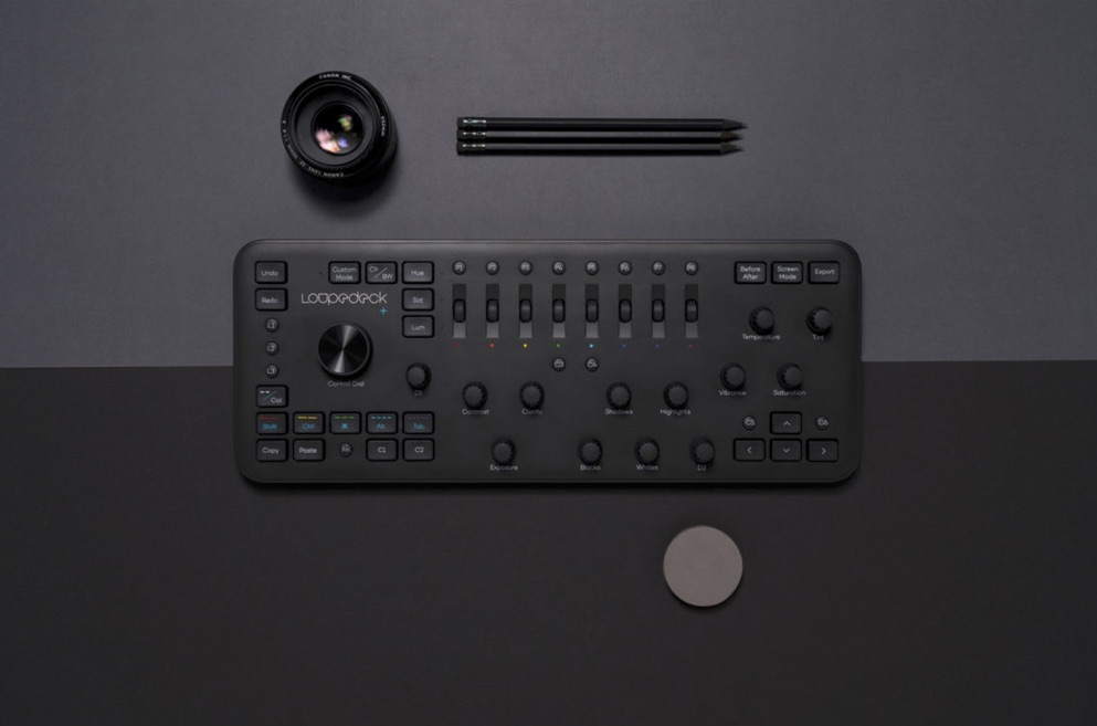
On first inspection, the new model looks quite well made though some of the keys and dials feel perhaps somewhat lightweight for every-day professional use. But then it’s not overly expensive, should you need to replace it. Nevertheless, the Loupedeck+ weight, size and shape, which is more or less like a regular keyboard, means it will likely fit a messenger style pack or small day-pack if humping around with a MacBook Pro. What’s more it doesn’t take up a lot of desk space. A single, permanently attached and quite long USB cable is all that’s needed — there’s no additional power requirements.
Capture One Pro support
After trying out the high-end and superbly made (but studio-oriented and pricey) Tangent Element panels, I was initially intrigued by the compatibility with Capture One Pro (trial link), though to be clear the support is only in beta and it works only with Capture One Pro 11/12 using the application’s keyboard shortcuts. For it to work at all, you must select Loupedeck_beta option in Capture One’s Edit Keyboard Shortcuts dialog. Despite the limitations this has without using Capture One’s underlying support (like it has for the Tangent panels), the Loupedeck + works pretty well. The main concern is that the panel’s layout is more Lightroom centric, particularly with regard to the some of the more specialized controls such as HSL buttons and nine wheels/buttons.
Capture One, for example, can use three of those wheels to adjust the Color Balance tool which, although it is really quite something, as you can switch between highlights, shadows and mid-tones using the HSL buttons, it isn’t really making full-use of the app’s or panel’s potential. It can’t access Capture One’s Color Editor tool at all, for example, and several of the panel’s controls don’t currently work with anything. These include the remaining six aforementioned color wheels, of course, as well as Custom Mode, Color/B&W conversion button and Before/After button.
In fairness, Capture One doesn’t really have a Before/After menu option as such, but it has a shortcut combination to perform a temporary reset instead which is the same thing by another name. To make matters worse many of the Loupedeck’s controls aren’t programable, including those, making them redundant, except the Custom Mode. When that’s engaged, it disables a lot of the panel’s controls. Hopefully that will change. Overall, though I think Loupedeck has done well to get what it can from Capture One; it is still a desirable and usable addition.
Lightroom Support
Most people will buy this for Lightroom Classic CC of course, but while it has support for Lightroom 6, it is limited (and should look at the original Loupedeck model instead which has full support). Loupedeck + makes a bit more sense when working in Lightroom than Capture One – mostly because of the modular nature of the Lightroom, the eight HSL control wheels and accompanying buttons and the fact that some of the controls change function depending on the module you’re working in. It’s not really significant but it just feels slightly more logical. Some of the controls also summon Lightroom’s on-screen tool descriptions, which is a nice touch while you’re getting used to operating the panel. As with Capture One, not all of buttons can be re-programmed — it’s a similar number but all of the buttons are mapped to a feature. The Color/Black and White conversion option works as advertised and the Before/After button, for example brings up the app’s side-by-side view. While that’s useful, it would be more user-friendly to offer a temporary reset, which could be adopted for Capture One as well.
Summing up
It’s not just the ability to look at your images without taking your eyes off the screen which is reason enough to consider one of these, one key benefit that’s exclusive to consoles like this is the ability to adjust two parameters at once. Let’s face it, there are certain tools such as the Sharpening, Noise and certain Exposure parameters (such as adjusting the Exposure and Brightness sliders together in Capture One) benefit greatly through simultaneous adjustment of multiple sliders. And it is consoles like this are the only devices that are capable of doing so. Sure you can find far better made consoles for Capture One Pro such as the Tangent Element series, which as modular, pro-grade panels can be mapped to practically all the tools but they’re pricey and aren’t portable. However, Tangent do offer other, more portable and accessibly priced panels. But if you’re only wanting to start out with something simple, given the attractive pricing and support for such a range of apps including Premier Pro and Photoshop, the Loupedeck+ should be at the top of your list.
You must be logged in to post a comment.