Capture One Pro 12 review
Introduction to Capture One Pro 12
As a RAW converter and processor, Capture One Pro is highly regarded in the pressured professional circuit for its out-of-the-box colours and perfectly weighted sharpening. It’s also well-liked by studios for its unique job-by-job image management option called Sessions and the ability to tie these in with the most advanced tethering solution you’ll find anywhere. If the photographer has his camera tethered to a computer it will be running Capture One Pro. No question. Capture One Pro is also making inroads with enthusiasts and beginners. First, Sony and now Fujifilm is bundling the scaled-back version Capture One with their new cameras, and offering discounts to upgrade to the fully-featured Pro version with its more advanced features such as the Color Balance and Color Editor tools, Layers as well as the Sessions and tethering capabilities. So what’s new in Capture One Pro 12?
Download a free trial of Capture One Pro.
Support this site
If you found this feature useful, please consider buying a license or subscription through our links. Sales through these links may earn a commission, which helps the running of this site. Thank you for your support.
New streamlined interface
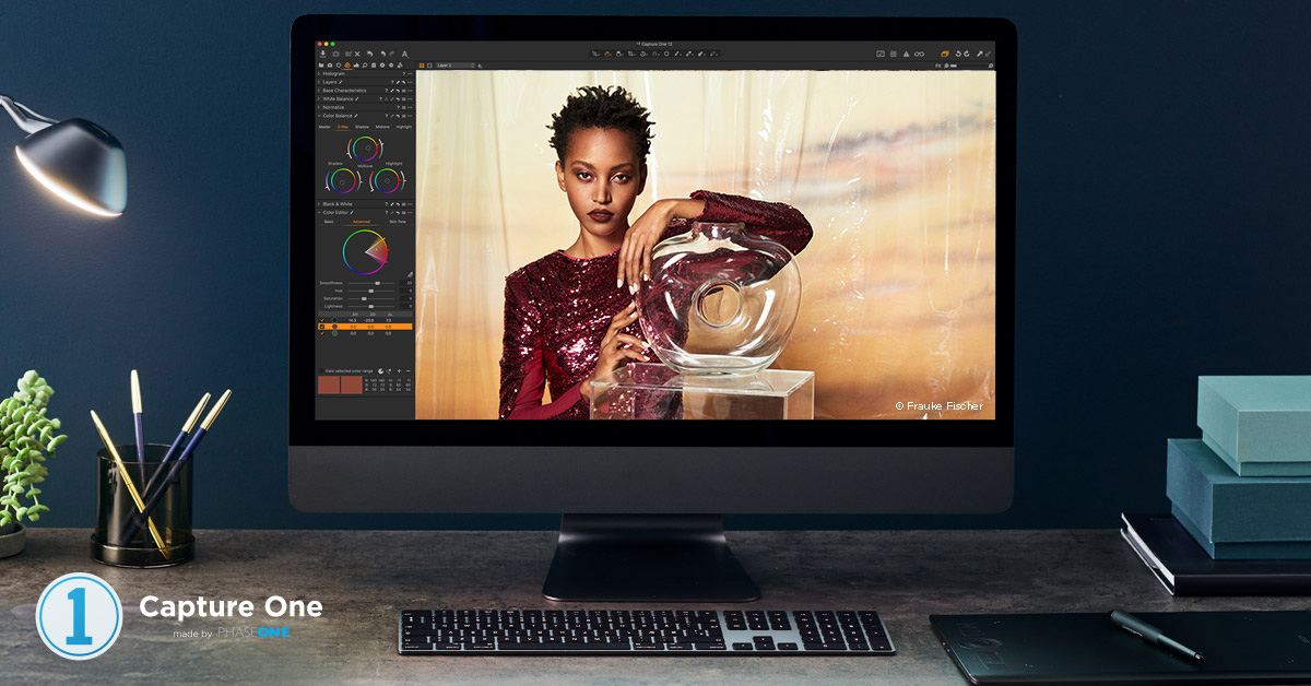
First, and the most obvious initially is the interface has been updated with a modern flat look. The silver-coloured type and tools on a deep black UI have been replaced with a warmer dark-grey background a leaner, uncluttered look than previous versions that’s not unlike that of rivals such as Luminar and Affinity Photo.
While this isn’t an exciting new tool to start a review with, it is likely to be the most contentious change to the app in recent history. I think the modifications are useful without being disorienting. Some of the icons have been redesigned and simplified for new users but, by and large, existing users need not worry unduly as the look and feel is familiar. More importantly, the layout has changed (except for some of the menus), so the redesign isn’t exactly going to perplex anyone.
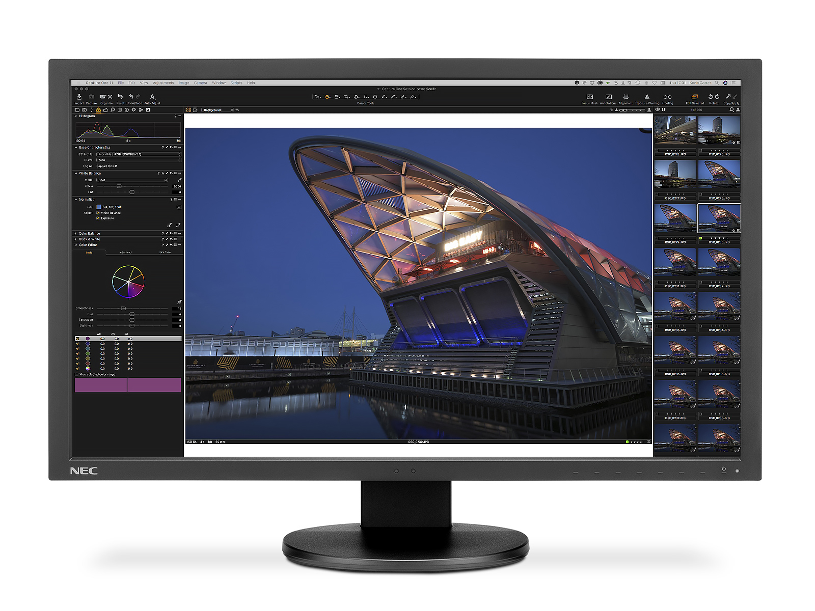
A lot of work has gone on under the hood to improve the readability of text when working with different display densities and resolutions.
Both text and the cursors look larger and clearer reducing the occasional moire in v11 on the QHD display panels still staunchly adopted by makes such as Eizo and NEC in their wide-gamut monitors and are still legible on 5K panels used at their native resolutions like that used on the Apple 5K iMac and iMacPro models. Although that was always an unfair criticism levelled at previous versions, in my view.
A contextual shortcut from the interface, tools and icons to the application preferences would have been nice. For example, you often want to quickly change among others the viewer’s background to white (the default remains a dark grey), or adjust the threshold of the Focus Mask. Still, that may come in later updates, especially as the already excellent Keyboard Shortcut editor’s functionality has been expanded to include more shortcuts to tools along with a much-needed search facility.
The changes don’t stop there though. In keeping with the refreshed interface, the application menus have been tidied up a little and aligned between Mac and PC.
Copying adjustments between images has always included compositional changes by default but now from version 12, you can exclude them. It’s not just compositional elements that can be excluded, the Spot removal option is manually selected now but it seems that was changed silently in 11.3, or maybe even earlier. Such bespoke control is all down to one of Capture One’s most underestimated tools, the Adjustments Clipboard.
Overall the changes to the menus, interface and browser are an improvement and, crucially for those who depend on this app for their livelihood, it doesn’t take too long to become accustomed to them.
Luminosity masking
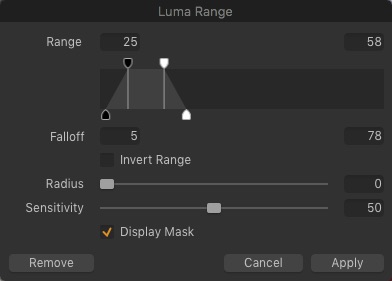
The new Luma Range tool finally brings luminosity masking to Capture One. Making and selecting a mask based on the luminance value of each pixel in an image is an incredibly versatile, precise and convenient way of targeting the tonal areas in the image, and opens up a whole new level of selection and editing capabilities in Capture One using practically any of the adjustment tools.
With a clever, if initially daunting, set of controls that open in a dedicated window, the new Luma Range tool is fortunately relatively simple to use, especially when working on a new filled mask.
Mimicking the controls in the Levels tool, it provides an option to restrict the masking selection to a specific range of brightness (luminance) values using just two sliders initially, with the others being used to adjust the fall-off (transition between tones) and smoothness of the edge of the mask. It’s a much more intuitive tool to use than the technique required in Photoshop but it’s not so different from the option in Lightroom even if it appeals to the more ‘visual’ types, which photographers are of course.
If you want only to recover details in a certain range of shadows or make a colour correction to mid and quarter-tones then this is the tool to use to make the selection. It can even be combined with the radial and linear gradient masking tools as well, just make sure you can see the mask while making the selection – the greyscale mask is more useful in this instance than the standard one. You can even copy the luma range between images, making the selection dynamic and especially useful when working on a sequence of similar images. Like other tools in Capture One, it’s non-destructive in use and can be altered at any time.
Take a look at this tutorial from Phase One :
Radial and linear-gradient masks
Before version 12 if you wanted to make a radial mask you had to brush a circular selection in, move it if you need to and if you wanted to adjust everything else instead you only had to invert the selection. Not a real issue if you knew what you were doing, but not as slick as rivals with a dedicated tool. Version 12 changes all that. Capture One’s new Radial Gradient Mask is a result of a new parametric masking engine. Not only is it intuitive in use allowing quick and easy adjustments to the shape, size and symmetry of the selection using the handles and guides, but the same engine now powers the Gradient mask. Renamed the Linear Gradient Mask, it has much of the same range of adjustments making the two practically identical to use.
Fujifilm Film Simulations
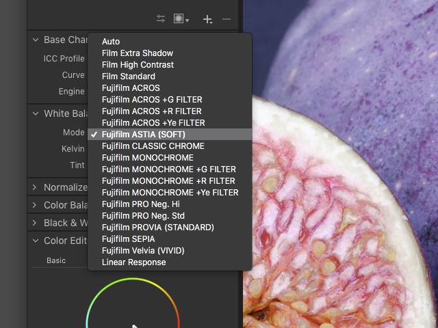
Although RAW files from certain Fuji cameras have been supported in Capture One for years, the inclusion of support for the medium format GFX series in version 11.3 has spurred the inclusion of Fujifilm Simulations in version 12. Found on the Fuji X-series as well as the GFX-series, these are sets of in-camera parameters that are used when processing files to produce out-of-camera JPEGs. In Capture One they’re replicated as tonal response curves, available from the Base Characteristics tool (see above screenshot).
In addition to the FujiFilm Simulations, Phase One has added their interpretation of this with their IQ4 digital backs as Built-in Styles; the IQ4 backs are the first from Phase One to offer in-camera parameters for processing out-of-camera JPEGs. As they’re Styles, you can apply them retrospectively, of course, stack (combine) them, fine-tune the adjustments and even create new ones from them. Only six are offered at the time of writing, but this is expected to expand. They’re available in the Styles and Presets tool and from the Adjustments menu.
Plug-ins
An attribute of rivals since their inception, user-installed plug-ins haven’t featured in Capture One before. Details of compatible plugins are still rather scant at the time of publishing. Potentially this opens up Capture One to several interesting possibilities. More on this will be announced later.
New camera support
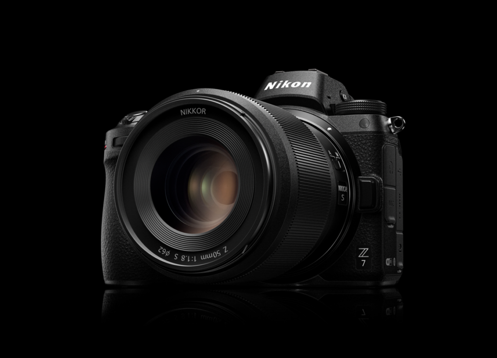
Capture One Pro 12 adds support for the new Nikon Z 7 and Z 6 as well as the Canon EOS R and M5. Phase One is likely to receive some criticism for waiting to include support for these in version 12 but you can usually convert files to DNG beforehand if you can’t wait for official support. A DNG Neutral profile is used initially although you may have to update some colour edits once the camera is officially supported.
In summary
Capture One Pro version 12 offers several welcome features, with luminosity and radial masking headlining those. If layers are an important feature in your workflow (and they likely are, even if used sparingly) then these two new tools are reason enough to consider the upgrade in my opinion. Phase One says that they’ve improved stability and overall speed of operation, and it does feel very responsive over 11.3.
New camera support is always welcome though, in reality, it’s of little consequence if you don’t have or intend to use those cameras. However bear in mind some organizations use multiple photographers, so support for a wide range of cameras and lenses is crucial. I like the new interface and the reorganisation of the menus makes a lot of sense.
When compared with rivals I like Capture One Pro because of Sessions – I rarely use Catalogs (which is the only image management option available in Lightroom) other than to archive, so the improvements are very welcome. If you’re new to Capture One Pro then I implore you to try it. It is the fastest and most rounded version to date.
Download a free trial of Capture One Pro.
Support this site
If you found this feature useful, please consider buying a license or subscription through our links. Sales through these links may earn a commission, which helps the running of this site.
Sales from the link may benefit this site. Thank you for your support.


3 Comments
Pingback:
Pingback:
Pingback: